There is no question that the e-commerce industry is a massive part of the international economy. With all major retail brands focusing heavily on this aspect, there are plenty of opportunities to prosper for new businesses as well. However, since it is a multi-trillion dollar industry, the competition is also fierce. Hence, brands and companies need to stand out.
What is the role of UX design for an e-commerce project?
As mentioned above, due to the hyper-competitive nature of the market, selling quality products isn’t enough to attract new customers. User experience or UX is also a very important criterion to scale up an e-commerce business. The idea is to attract and make a user attached to a particular brand or product so that they are converted into repeat customers. And making an attractive website that is logical and easy to navigate plays a major role in achieving this.
Moreover, repeat customers also guarantee more revenue, as it was found in an analysis that regular e-commerce clients spent almost 67 percent more than new ones.
Now that the importance of UX design optimization is clear, here are 7 ways to seamlessly achieve this in real-time.
7 Ways to Design Your E-commerce Store That Drives Conversion:
1. Add Clear CTAs
Clear call to action or CTAs are essential for any business’s website, and even more so for an e-commerce operation. For the uninitiated, CTAs are basically prompts or directives that are made to persuade the user browsing the website to take a particular action. Thus, for an e-commerce website, the CTA could be ‘Buy Now’, or ‘Add to Cart’, prompting them to make a purchase. For an effective CTA, make sure to use bright colors and bold letters that make them stand out across the entire page.
Furthermore, it is also important to ensure that the CTA prompt matches the website in terms of design as well as intent. For example, if a customer is on a product page, then the above mentioned ‘Buy Now’ would be appropriate. However, if they are browsing content or product details, then ‘Read Now’ might be a better fit. Another thing to keep in mind is to keep the text short and to the point, ideally just a word or a very short phrase.
Lastly, one must also not push the envelope too much and come off as aggressive, as no user likes pushy marketing tactics. Ultimately, striking a fine balance between being persuasive without being overbearing in terms of CTAs takes practice.
2. Improve Product Listing & Filtering Performance
For most e-commerce goods that feature multiple options and customizations, product listing becomes a lot more complicated than simply displaying these items. For starters, one must make sure that the images used on the product listing page is accurate, attractive and of high quality.
Now, while selecting a particular product, there might be multiple parameters that the user may need to select such as product color, size and more. For such e-commerce goods, it’s paramount to have a smooth filtering system that is seamless in performance. While it might not be perfect for every user, it needs to appeal to the majority at the very least.
Adidas’s UX design is a great example of great product listing and filtering performance. It has been found that almost 60 percent of their customers are happy with the company’s product listing and filtering interface. Their comprehensive filtering is based on multiple parameters such as gender, color, size, material, brand, price range, product category and product type. Another great example of filtering are e-commerce websites that incorporate size comparison charts for both US and European customers for shoes as well as apparel, so that clients can be clear with their selection irrespective of geography.
3. Design Simplistic Layout
The minimalist movement is appealing for a reason – sometimes less is indeed more. In terms of optimizing UX design and improving conversion rate, this philosophy is time-tested and highly effective. Thus, opt for web designing services to create a site that is simple and to the point. This will help your e-commerce business attract new customers and boost your sales revenue.
There are multiple ways to achieve this:
- Primarily, use more images and minimize text to make the website look more spacious. It would be great if you can use an explainer video on your homepage. Using white in the background also plays a role in creating this illusion of space and simplicity.
- Next, the CTAs need to be the core focus of a page as they are designed to influence the decision making process of the user. Hence, it would be wise to remove all design elements from a particular page that might distract the customer’s attention from the CTA.
- Lastly, make sure that your website offers a smooth experience across all devices, especially mobile phones. Since most e-commerce users now make a purchase from their smartphones, it’s critical to keep the user experience as seamless as possible on this platform. In the end, implementing these steps might lead to significant modifications to the website, but the long term dividends of this update is worthwhile.
4. Personalized Product Recommendations

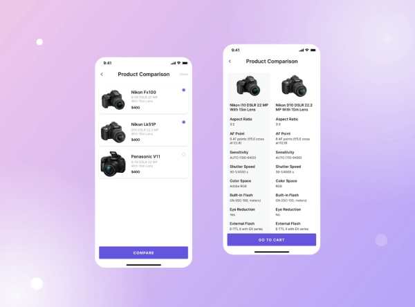
It is no secret that every user that browses an e-commerce website will often compare different brands and products before making a selection. Hence, an optimized UX design will make the process a lot more convenient for the user. One way to do this is by introducing a tab which recommends products similar to the one they are searching for.
This will provide an automatic comparison for the customer on the same page. Another method to offer product recommendations is by creating a trending page for each product category, as it offers social proof to the user. Often, products that have been purchased regularly will continue to garner interest from first-time customers as well.
While these steps are the norm for most e-commerce platforms, you can go one step further in terms of personalization. Typically, a shopper has a tendency to browse multiple product pages and consequently, they often get lost among the neverending options, making it a challenge to navigate back to the original product page. Thus, if you can create a feature that lets the customer revisit the original page after such browsing sessions, then you will automatically improve their shopping experience, prompting them to revisit the e-commerce website repeatedly.
5. Optimize Your Website For Mobile & Work On Overall Loading Speed
As mentioned above, most people browse the internet on their mobile phones, and this goes for e-commerce sites as well. Hence, it is critical to keep the website minimalistic and streamlined, especially in the checkout section of the page. Opting for single click check out, for example, goes a long way in converting more repeat customers.
Conversely, a complicated web design and check out section can have an adverse effect, as the small screens can make it more challenging to keep a customer’s attention. Moreover, due to the unreliable nature of mobile data and the changing locations of the user, it is an unfortunate fact that the network can drop at any time. However, optimizing your website for smartphones can circumnavigate these problems.
Speaking of unreliable internet connection, it is equally fundamental to not compromise on the loading speed of your website, especially for e-commerce sites. In fact, a delay of even one second can lead to unprecedented bounce rates, taking away thousands of potential customers from the equation, consequently causing millions of dollars worth of losses in a year. Hence, apart from simplifying the UX design and streamlining it across multiple platforms, care must be also taken to boost loading speed to optimize conversion rates across time.
6. Make On-Site Search Simpler
While optimizing other aspects of the website might work in improving the overall user experience, one can’t forget the basics, namely the on site search bar. Most users visit an e-commerce website from other search engines. And it’s important that those who want to search on a specific page on a platform must have a hassle-free option to do so. This is where the search bar enters the equation. It enables users to access the clutter-free product pages, CTAs and various personalizations.
There are plenty of ways to optimize the search option. Taking a leaf out of the e-commerce giant Amazon’s book, here are a few actionable tips to significantly improve the search tab:
- Enabling autocorrect: Since most users are browsing websites on their mobile phones, they might end up using abbreviations or have typos in their query. Hence, an adept search bar should be able to automatically correct these discrepancies and provide accurate results.
- Offer auto suggestions and fillers: While it is great to enable autocorrect, it would be even more optimal if the customers don’t have to type the name of the entire product. By enabling the autofill feature, a search bar can provide multiple suggestions and fillers based on the first few alphabets entered by the user, saving precious time.
7. Allow Guest Checkout And Account Selection

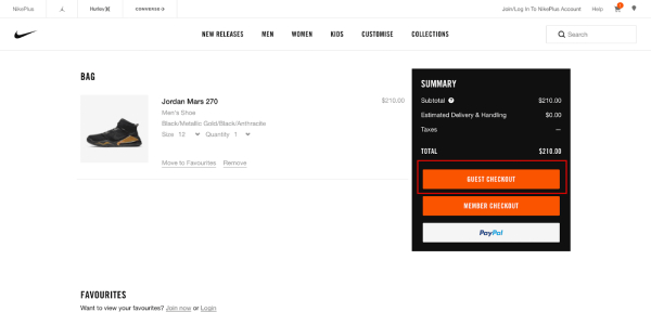
Let’s be frank, nobody wants to create a new account just to purchase a product, likely due to needless promotional emails and texts. Hence, an e-commerce website must allow guests to easily browse, select and purchase a product with minimal clicks and interruptions. This is why companies that offer a seamless, one-click checkout experience for guests and account holders alike will garner maximum customers. Here is an example from Nike:
In case a consumer does decide to create an account, then it’s equally important to make it as quick and easy as possible. The sign-up page should be short, to the point, and should only take mere seconds.
Apart from taking in the input details, password creation is another aspect of account creation that can turn off potential customers. While security is paramount, it should ideally not interfere with user experience. Hence, it is best to avoid complex password creation processes. This, in tandem with an easy to fill input field will guarantee a smooth account creation process for any user. Furthermore, you can now send promotional content to their email now that you have gained their trust.
Conclusion
In conclusion, by applying these 7 basic tips of UX design optimization, you can convert most e-commerce window shoppers into loyal customers. Of course, there are almost infinite ways to keep boosting conversion rate optimization, so any additional action apart from the ones stated above might provide even better results. But the bottomline is that if you are running an e-commerce business, then these steps are pretty much non-negotiable if you want scale up in this field.
